Using CSS variables with TailwindCSS
Deepankar Bhade /
When it comes to styling solutions, tailwind has become a go-to solution to build web applications. And the reason is justified you can build and ship websites faster and still have 100% control over the styling unlike other CSS frameworks (Bulma, bootstrap, etc).
I have been using it for a long time now I am loving the developer experience of it.To make things even better I use CSS variables with tailwind. Now you might be thinking why would someone do that? doesn't tailwind already has the config to add such tokens, well let me give my 2 cents on this.
Every project i create has light/dark theme and one can easily integrate it with tailwind by using the dark: prefix. In the example below I basically write 2 styles (classes) for light/dark variants.
<div class="bg-white dark:bg-black">
  <h1 class="text-black dark:text-white">Hello World</h1>
</div>
Instead of writing such 2 classes all over my codebase I just map tailwind utility classes to CSS variables.
Let's find out how we can integrate CSS variables in TailwindCSS, i already have setup nextjs & tailwind here's the github repo if you wanna follow along.
First thing you need to do is create variables of your theme variants. I will use data attribute as the selector.
@tailwind base;
@tailwind components;
@tailwind utilities;

:root {
  --foreground: white;
  --background: black;
}

[data-theme="light"] {
  --background: white;
  --foreground: black;
}
Now to hook it up with tailwind we will alias this in it's config.
module.exports = { mode: "jit", purge: ["./pages/**/*.{js,ts,jsx,tsx}", "./components/**/*.{js,ts,jsx,tsx}"], theme: { colors: {foreground: "var(--foreground)",background: "var(--background)"} }, variants: { extend: {} }, plugins: [] };
Now let's add some content to index.jsx,
export default function Home() {
  return (
    <div className='h-screen w-full bg-background flex flex-col justify-center items-center space-y-4'>
      <h1 className='text-foreground text-2xl font-bold'>Hello World</h1>
    </div>
  );
}
Now if you do yarn dev and see you should be able to see "Hello World".But how do we toggle themes? Here we lose tailwind's method to toggle theme but don't worry there's a simple solution.
We will use a package called next-themes by @Paco . The package by default modifies the data-theme attribute on the html element, which is exactly what we want.
We will wrap our App component with the <ThemeProvider /> and use the theme hooks provided by the package to toggle our theme.
import '../theme.css';import { ThemeProvider } from 'next-themes';const App = ({ Component, pageProps }) => (<ThemeProvider><Component {...pageProps} /></ThemeProvider>); export default App;
import { useTheme } from 'next-themes';
import React, { useState, useEffect } from 'react';

export default function Home() {
  const [mounted, setMounted] = useState(false);
  const { resolvedTheme, setTheme } = useTheme();
  // After mounting, we have access to the theme
  useEffect(() => setMounted(true), []);
  return (
    <div className='h-screen w-full bg-background flex flex-col justify-center items-center space-y-4'>
      <h1 className='text-foreground text-2xl font-bold'>Hello World</h1>
      <button
        role='button'
        onClick={() => setTheme(resolvedTheme === 'dark' ? 'light' : 'dark')}
        className='outline:none bg-foreground text-background px-4 py-2 rounded-lg focus:ring'
      >
        {mounted && resolvedTheme === 'light' ? 'Dark Mode' : 'Light Mode'}
      </button>
    </div>
  );
}
Awesome now you should be able to toggle themes.

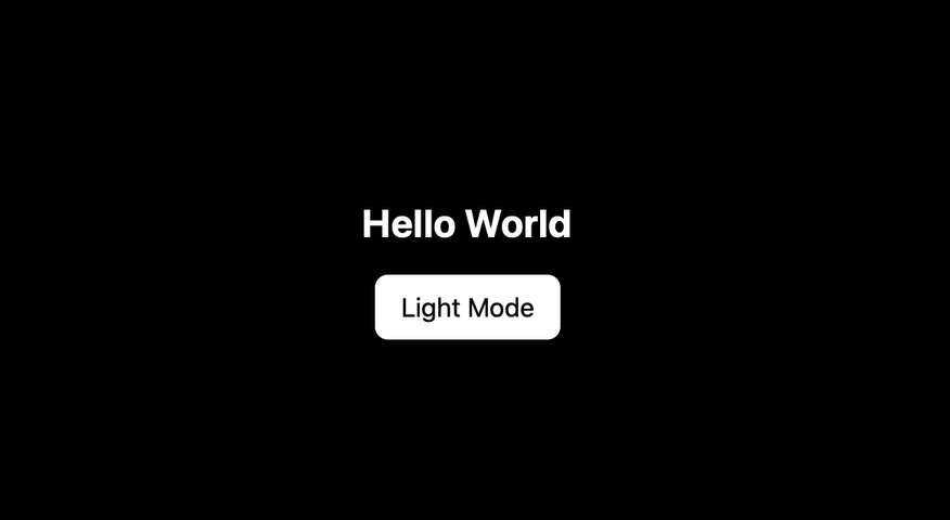
Toggling theme
You can refer to the code on github here . Hope you found this article helpful.
NoteA quick favour: was anything I wrote incorrect or misspelled, or do you still have questions? Feel free to message me on twitter .